Halo of Hope
Halo of Hope had grown into a trusted nonprofit serving families across North Mississippi, but its visual identity no longer reflected the professionalism, warmth, and impact of the organization. Cardinal South was brought in to create a refreshed brand identity that would better support its mission while providing a consistent foundation for print materials, fundraising efforts, social media, and a new website.
The updated brand centers around a clean, approachable logo system inspired by the organization’s name and purpose. Combined with a bright, welcoming color palette and modern typography, the new identity helps Halo of Hope present a recognizable and trustworthy image while reinforcing its mission of connecting sponsors, volunteers, and families in need.
Halo of Hope had established itself as a trusted nonprofit serving families across North Mississippi, but its visual identity lacked consistency and flexibility. The challenge was to create a recognizable brand that communicated hope, generosity, and community while remaining practical across fundraising materials, social media, merchandise, printed resources, and a growing digital presence.
We developed a refreshed logo system centered around a simple, memorable mark inspired by the organization's name and mission. Clean typography, approachable colors, and scalable logo variations were selected to ensure the brand could remain consistent whether displayed on a website, sponsorship materials, event signage, apparel, or promotional items.
The new brand identity gives Halo of Hope a professional and unified presence across every touchpoint. The refreshed logo system strengthens recognition, builds trust with sponsors and families, and provides a foundation that supports future growth. The result is a brand that feels welcoming, dependable, and reflective of the organization's mission to bring hope to the community.
Halo of Hope
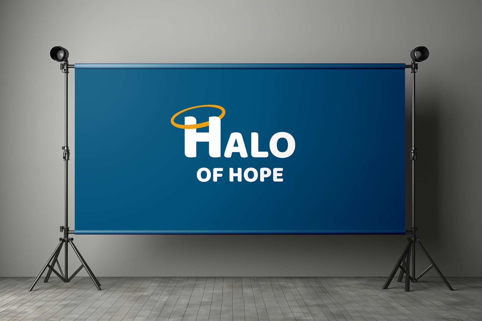
The primary Halo of Hope logo combines a bold letterform with a simple halo element that immediately reinforces the organization's name and mission. Designed for clarity and recognition, the logo remains effective across digital platforms, printed materials, fundraising campaigns, and event signage while presenting a friendly and professional image.

Halo of Hope's color palette was selected to communicate trust, hope, and generosity. The deep blue creates a sense of stability and dependability, while the warm gold introduces energy, optimism, and compassion. Together, the colors provide a recognizable visual foundation that feels welcoming to families, sponsors, volunteers, and community partners.

The Halo of Hope lettermark simplifies the brand into a single recognizable symbol. The halo element creates an immediate connection to the organization's mission while allowing the mark to function effectively in smaller applications such as social media profiles, website icons, apparel, promotional products, and branded materials.
The Halo of Hope identity was designed to remain highly visible and recognizable in real-world applications. Whether displayed on signage, event materials, banners, or promotional displays, the clean logo system maintains strong readability while helping establish a consistent presence throughout the community.
Whether you need a new website, stronger branding, or a clear marketing direction, we’re here to help you move forward with confidence.
Let’s create something that actually supports your business and helps it grow.