Crossroads Church
As Crossroads Church prepared to move into their new facility, their leadership recognized the need for a brand identity that matched the tone and quality of their evolving space. The church already had an established color scheme integrated into the interior design of the new building but lacked a unified digital identity to accompany it. Cardinal South Creative was brought in to design a modern logo system and select brand typography that would connect the church’s physical environment with its online and print materials.
The final design features a clean, balanced mark that communicates clarity, community, and growth, which are all values at the heart of Crossroads’ mission. The selected typeface complements the new mark and color palette, ensuring the church’s signage, print pieces, and digital platforms present a unified and recognizable brand.
Crossroads Church’s new building design already established the visual tone of their brand through colors and interior finishes. The challenge was to translate that aesthetic into a logo and typographic system that would feel connected to the new space while functioning effectively across digital and print formats.
Instead of rebranding from scratch, we developed a visual identity that respected the existing color scheme while introducing new digital elements for consistency and flexibility. The logo design process focused on simplicity and scalability, producing a brand mark that would look equally strong on signage, social media, and printed materials. We paired this with a carefully chosen typeface that reinforced readability and brand unity.
The new logo and type system bridge Crossroads Church’s physical and digital environments, presenting a unified brand presence that feels both timeless and contemporary. This foundation now serves as the visual backbone for the church’s signage, printed materials, and future website, allowing their growing congregation to experience one consistent identity wherever they engage.
Crossroads Church

The color palette for Crossroads Church blends modern neutrals with grounded, natural tones to create a warm yet contemporary aesthetic. The mix of deep blue-gray, soft beige, and muted bronze communicates stability, approachability, and faithfulness while maintaining a timeless, professional look.
The Crossroads Church primary logo combines simplicity and meaning, built around a bold “C” that represents both connection and direction. This mark captures the church’s mission to guide people toward faith and community through a clean, modern identity.
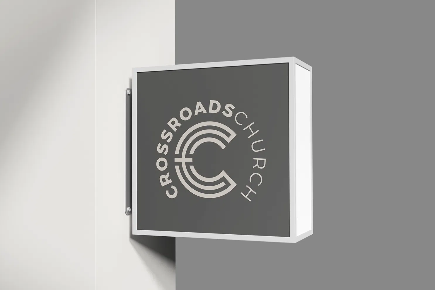
The secondary logo offers a more traditional layout, pairing the symbolic “C” mark with the church name for versatile use across digital and print media. This version strengthens brand recognition while maintaining a modern and approachable identity for the Crossroads Church community.
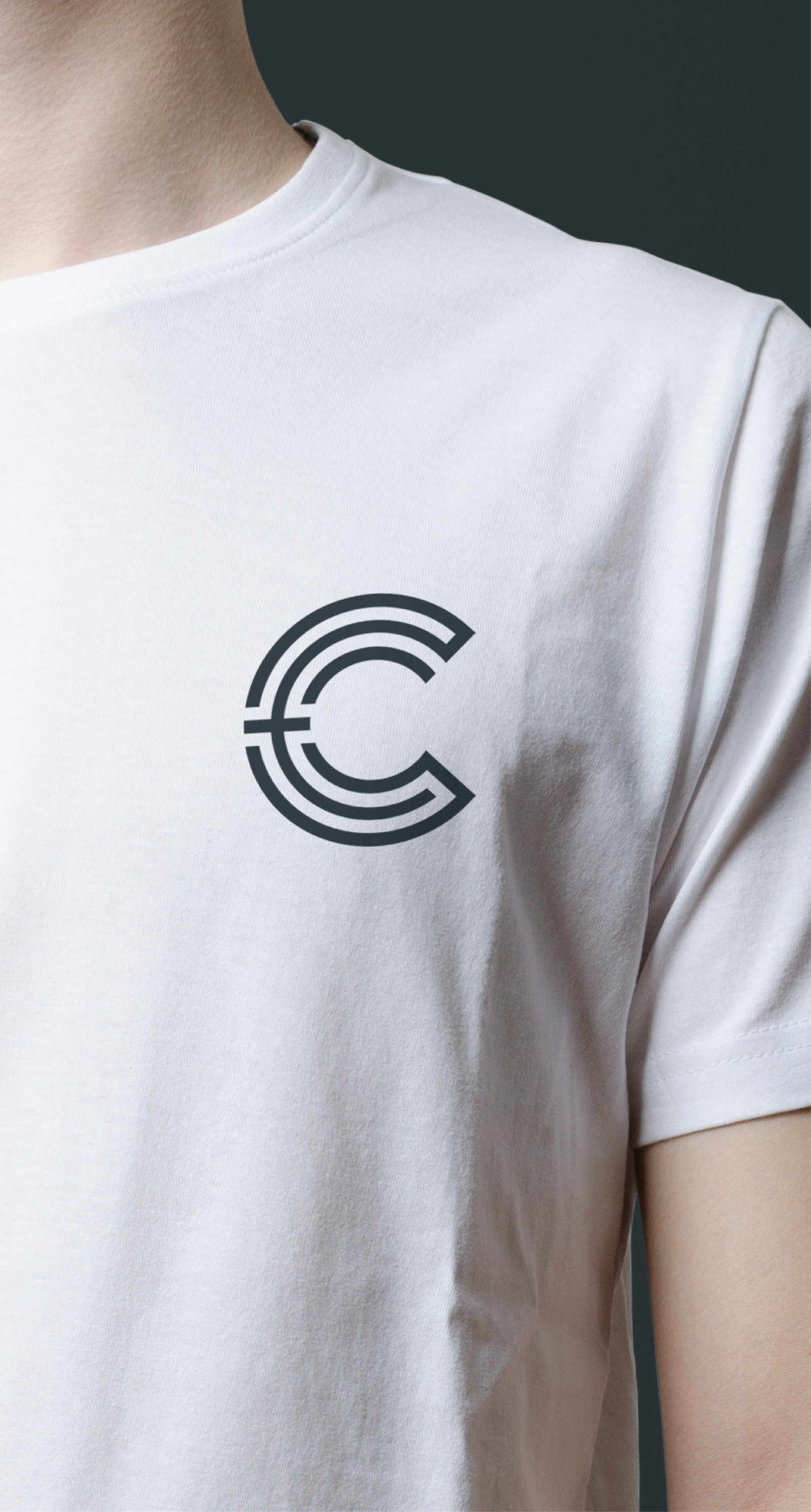
The Crossroads Church lettermark brings a clean, modern touch to apparel design. This simple chest placement highlights the brand’s identity in a subtle yet professional way, making it perfect for staff, volunteers, and members to wear at events or in daily life.
The tertiary logo delivers flexibility with a lighter, more inviting tone. Its soft color palette and balanced layout make it ideal for use across branded materials where a warmer, more approachable presence aligns with Crossroads Church’s welcoming and community-focused identity.
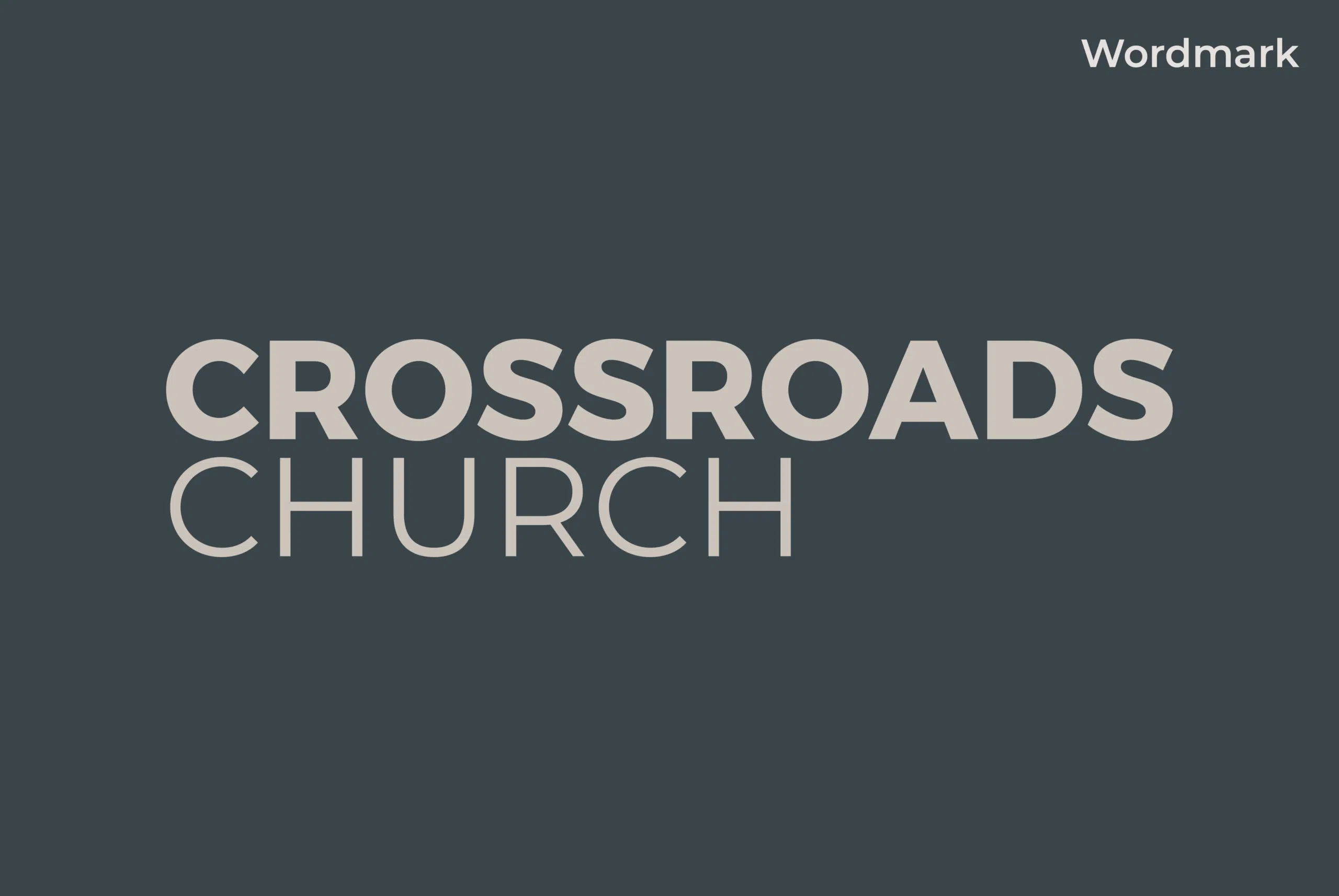
The Crossroads Church wordmark emphasizes strength and clarity through clean typography and balanced spacing. Designed for versatility, it stands confidently on its own across digital and print applications while reflecting the church’s commitment to faith, clarity, and connection.
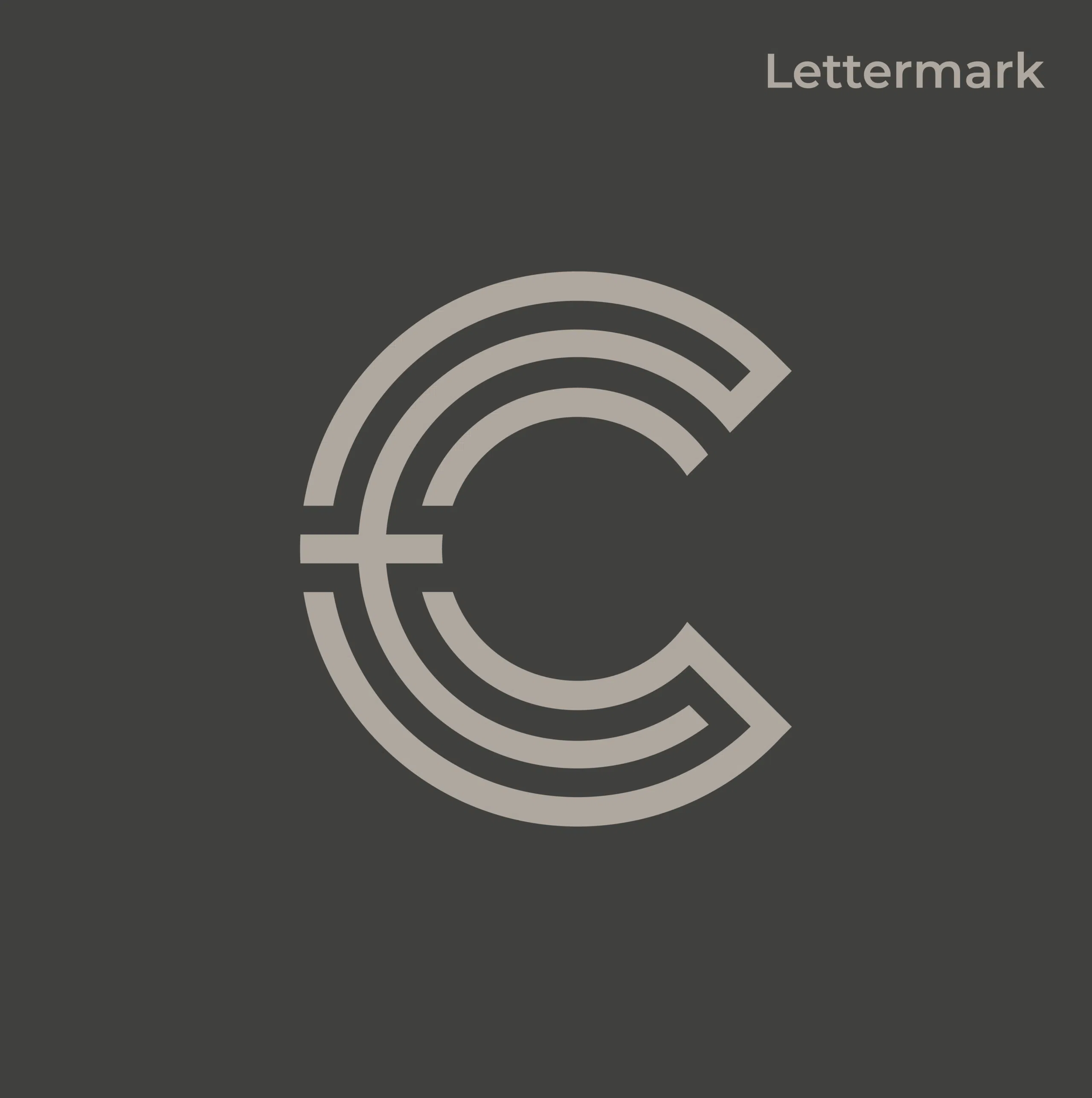
The Crossroads Church lettermark captures the essence of the brand through a bold, unified “C” that symbolizes connection and direction. Its layered design represents growth and community, while clean lines and balance convey a modern and trustworthy identity for the church.
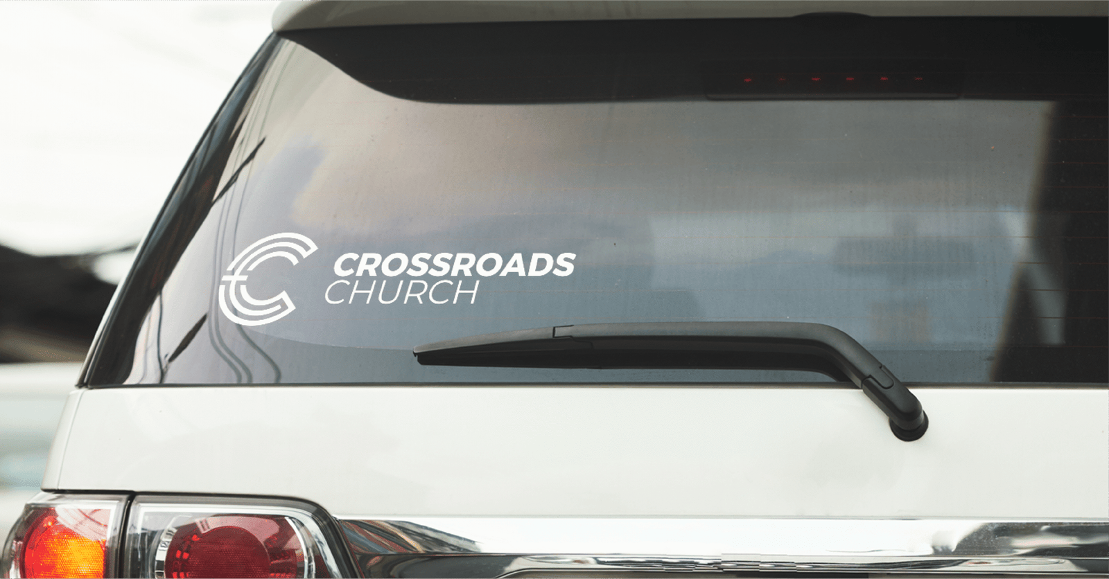
The Crossroads Church logo translates seamlessly to real-world applications, as shown in this vehicle decal mockup. Its clean, versatile design maintains visibility and brand recognition in any environment, helping members proudly represent their church throughout the community.
Cardinal South Creative made our logo update such an easy and enjoyable process. They really listened to our vision and delivered a design that was spot on from the start. We were actually able to wrap up the project about 10 days early because the design fit us so well. The final logo truly fits us, and we couldn’t be happier with the outcome. Highly recommend their work!
Whether you need a new website, stronger branding, or a clear marketing direction, we’re here to help you move forward with confidence.
Let’s create something that actually supports your business and helps it grow.